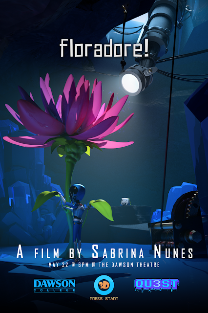
Sabrina Nunes
Mmm... Art. • - •
April 02, 2015
February 20, 2015
Journal Entry - Cinematography
Mid semester is around the corner and my short film is underway. The past couple dozen months have been challenging and now I am on the verge of graduating. I have reached a few conclusions in regards to my career and personal growth.
First, there are many things that I don't like and it is because among these subjects there are others that I greatly enjoy. When I started my studies in animation at Dawson two and a half years ago, I had no idea what I wanted to do. I tried my best at everything I learned, and I enjoyed doing so because learning about all these new areas of information, just like in a box of assorted chocolates where you are curios about what each chocolate tastes like and are excited to taste something new, you never know what you are going to get. Two years into the program, a special interest starts to take form for me and an appreciation for lighting begins to grow. When you begin to like one thing very much, others appear mediocre and less interesting.
Second, I discovered that liking one thing meant I liked many others. It isn't lighting that I like, it is all that is involved in how a shot looks. How the camera behaves, where the characters sit and how they are framed, the mood created by the lighting and sound, and how all these aspects interact are all tiny parts of a larger whole.
Third, there really is a lot to learn. You realize that someone can spend their entire career specializing on a tiny single part of a huge world. A world that encompasses everything from the physics of color, lenses, and movement to the psychology that lies behind the mind of all that is living, to the understanding of storytelling its power in influencing or entertaining.
Don't know where I am going with this just yet. It might have something to do with this debate in my mind that argues "DO YOU WANT TO SPECIALIZE OR DO YOU WANT VARIETY IN YOUR LIFE?" and at this point, where I feel like I'm right at the beginning, I feel like I don't even need to be thinking about this because I'm nowhere near specialized at the moment and have only barely dipped my toes into an ocean of information.
YAY MY CONCLUSIONS ARE SO GOOD TODAY!~
Labels:
journal entry,
personal
February 06, 2015
Update on Animated Short - Environment Development
The past couple of days were spent putting together all the assets and beginning to layout the film.
Although I thought all assets were built to scale, they were not. I forgot to make sure that after exporting the assets and importing them into Maya that they were the right heights. Most assets were simply to make to scale. Those who had SSS in their shaders required adjusted. The most difficult to scale were the character rigs, but that is on its way.
The lighting is a draft, as is the layout. I have used a script called Debris Maker to create rocks, crystals, and other environmental assets that will fill in the emptiness of the scene.
First layout composition
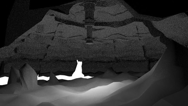
Layout with some shaders and highlights (post-resize)
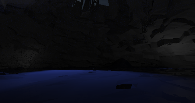
Positioning of objects, picking a camera angle, shaders (pre-resize)
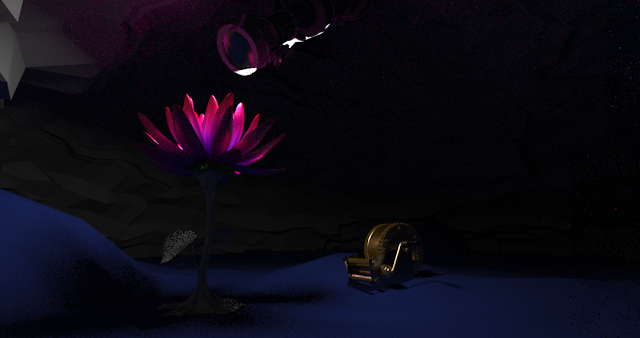
With scale readjustment: SSS in flower petals is not accurate
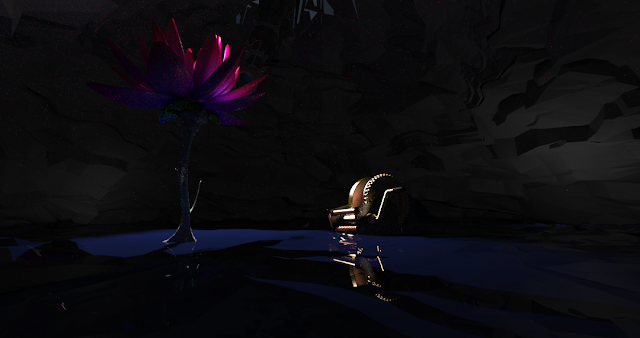
Although I thought all assets were built to scale, they were not. I forgot to make sure that after exporting the assets and importing them into Maya that they were the right heights. Most assets were simply to make to scale. Those who had SSS in their shaders required adjusted. The most difficult to scale were the character rigs, but that is on its way.
The lighting is a draft, as is the layout. I have used a script called Debris Maker to create rocks, crystals, and other environmental assets that will fill in the emptiness of the scene.
First layout composition

Layout with some shaders and highlights (post-resize)

Positioning of objects, picking a camera angle, shaders (pre-resize)

With scale readjustment: SSS in flower petals is not accurate

Labels:
3D,
environment,
Final Film Production,
layout,
Shaders,
Textures
January 22, 2015
Animated Short - Shader Development
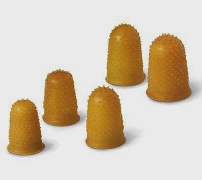
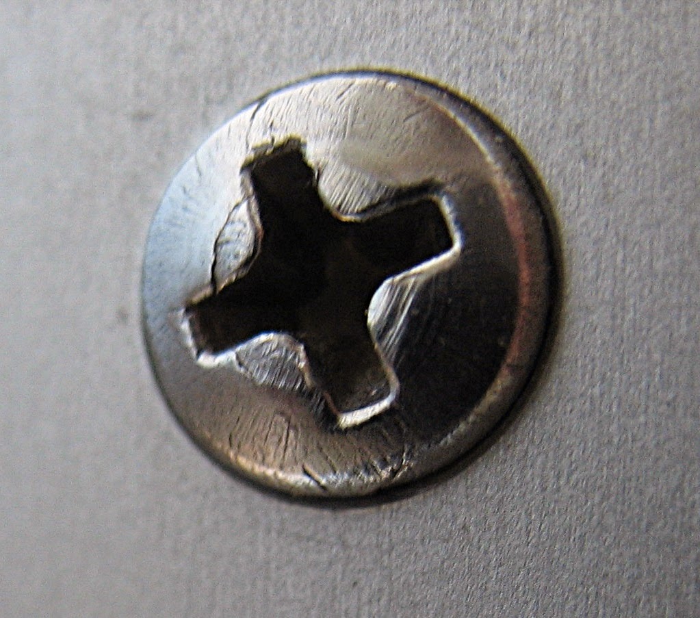
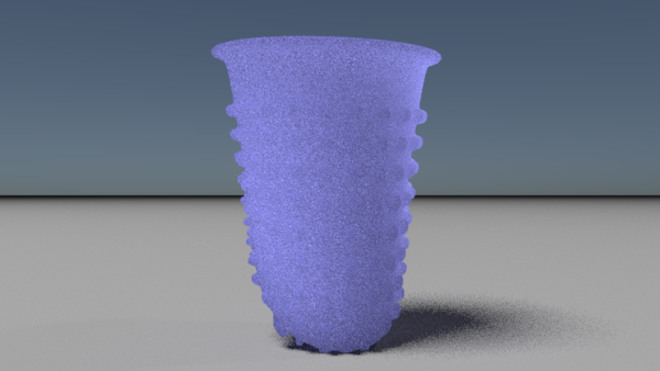
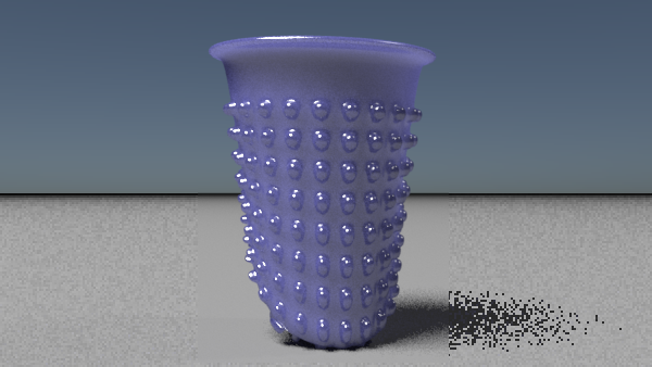
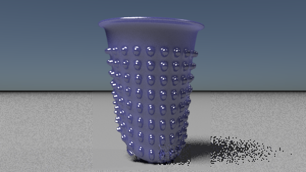
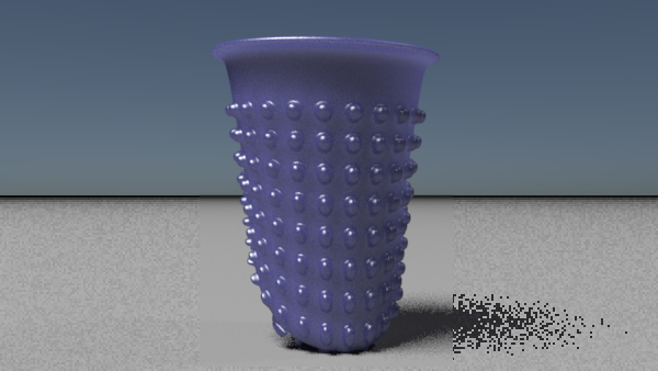
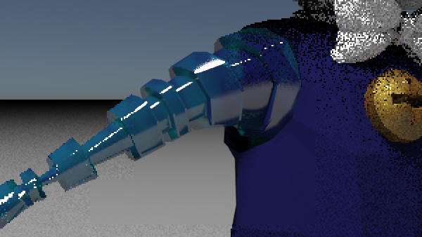
Focused on creating a shader for the rubber thumb. The SSS has a very small radius since the characters are very small, and rubber thumbs are small to begin with (characters are around 13 cm in height - in proportion to real sized toy characters - the entire film is scaled according to the flower and telescope and could potentially exist in real life). The image with the orange rubber thumb is a real photograph and to the right is the progress I took to create the shader. I started from the root of the object after adding a base diffuse color and focused on what made up it's center, which is a rubbery, thin material that has SSS, just like skin. Then I added a rough reflection as it appeared to be in the reference image. I went back to tweak the SSS to get a large value just like in the reference, below the white reflection.
I also spent some time experimenting with different colour schemes for Vladimir. I think I prefer the green as it makes him feel less... Blue. ;)
.jpg)
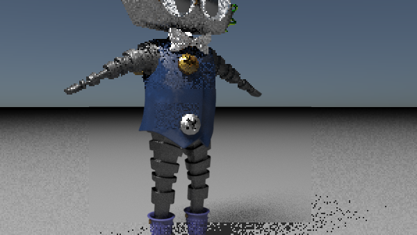
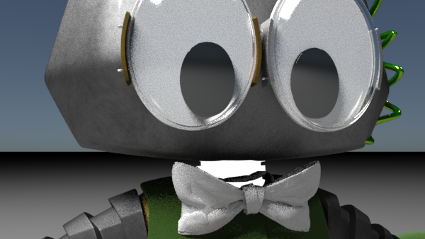

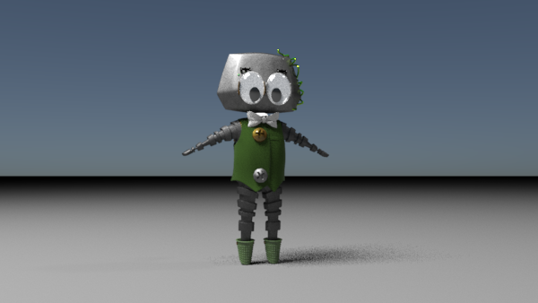
I also spent some time experimenting with different colour schemes for Vladimir. I think I prefer the green as it makes him feel less... Blue. ;)
.jpg)


Labels:
3D,
Final Film Production,
Shaders
January 14, 2015
Final Film - Finalizing Models and Working on Shaders
I spent my time during the holidays working on textures, shaders, and character rigs.
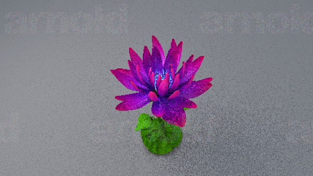
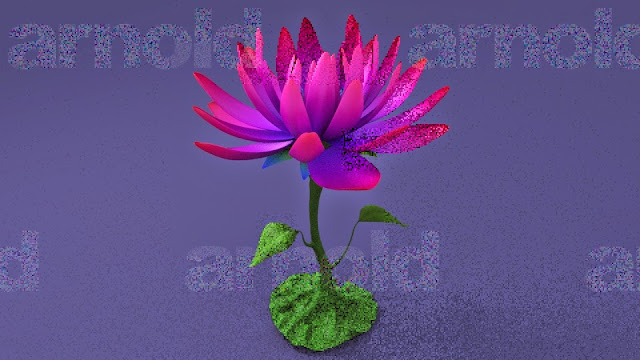
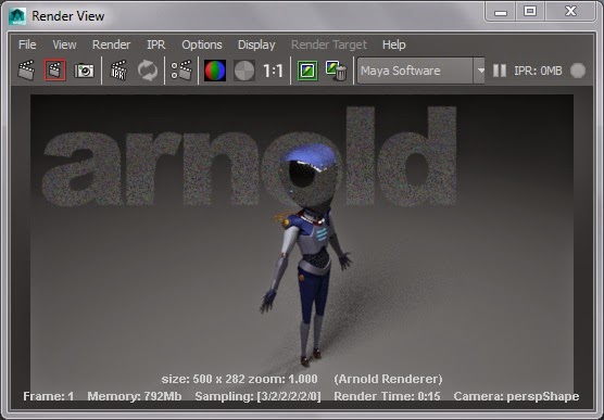
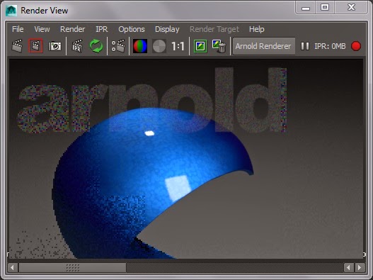
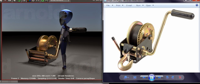
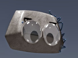
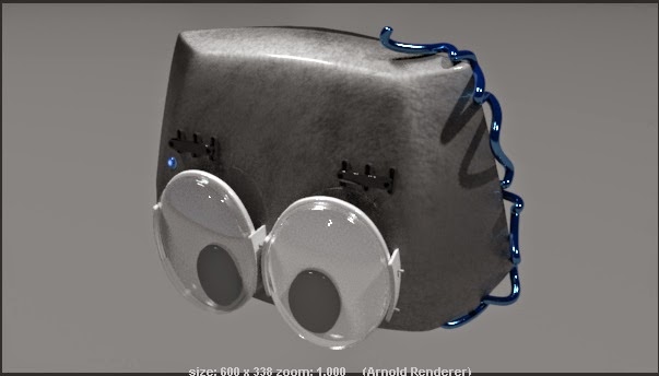
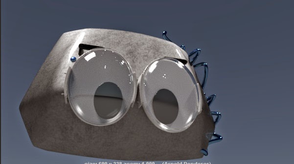
The Arnold aiStandard or SSS shaders will be layered using Maya's Layered Shader. For the aiStandard, I noted that tweaking the opacity setting in the shader's parameters was required if I wanted to add a gloss over a matted paint layer on metal. A map could be used to add rust or dust, or any other added details. For the SSS in the plant, I followed the tutorial found on Arnold's support suggested to me by a coworker.
Here are some quick renders I saved during the time I worked.
.jpg)
.jpg)
.jpg)
.jpg)
.jpg)
.jpg)
.jpg)
.jpg)
It's a work in progress and there are still many things that require fixing and polishing. There are no textures on the characters as of yet, and I will need to make time to do some, though time is ticking and I need to move onto other steps and assure I do the best I can in all the different areas of the film!
The Arnold aiStandard or SSS shaders will be layered using Maya's Layered Shader. For the aiStandard, I noted that tweaking the opacity setting in the shader's parameters was required if I wanted to add a gloss over a matted paint layer on metal. A map could be used to add rust or dust, or any other added details. For the SSS in the plant, I followed the tutorial found on Arnold's support suggested to me by a coworker.
Here are some quick renders I saved during the time I worked.
.jpg)

.jpg)
.jpg)
.jpg)
.jpg)
.jpg)
.jpg)
.jpg)
It's a work in progress and there are still many things that require fixing and polishing. There are no textures on the characters as of yet, and I will need to make time to do some, though time is ticking and I need to move onto other steps and assure I do the best I can in all the different areas of the film!
Labels:
3D,
Final Film Production,
Modeling,
Shaders,
Textures
Sketches
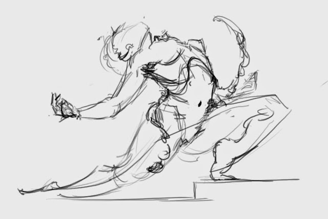
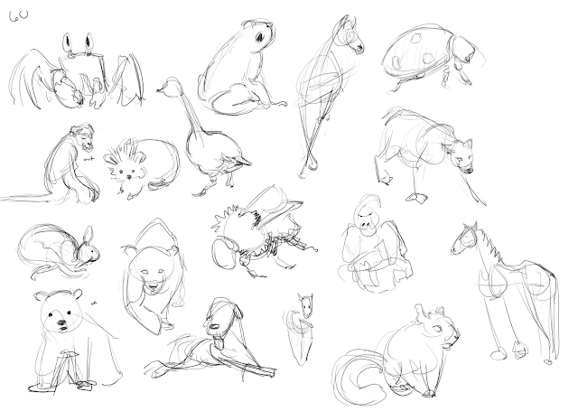
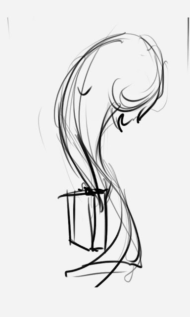
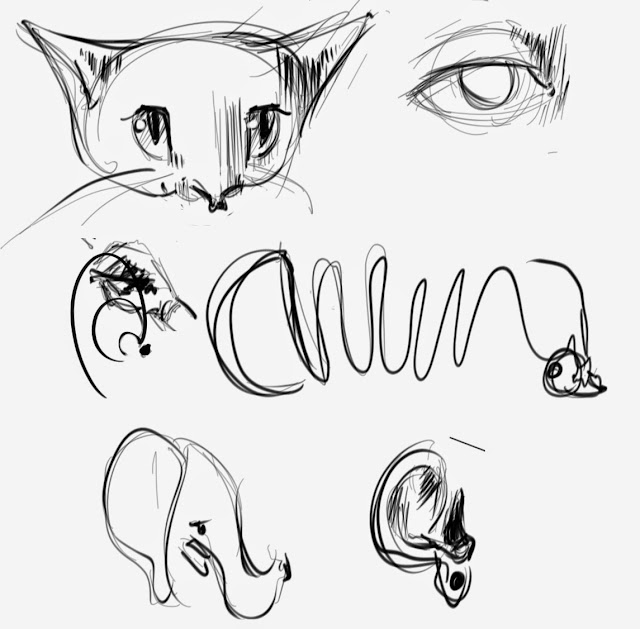
Holiday sketches. First two were done while Julian played piano for me.
Not sure where the rest belongs.
.jpg)
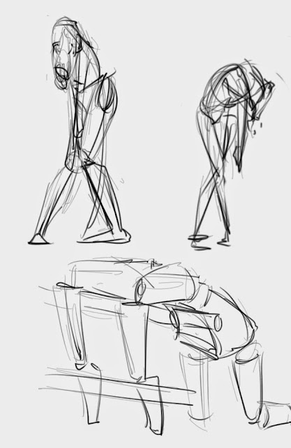
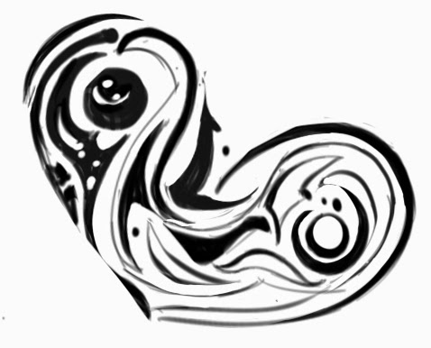
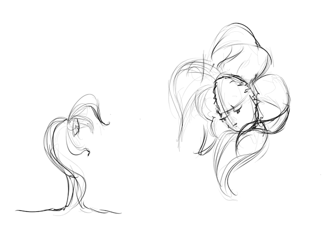
Why don't I take the time to draw more often? It feels so refreshing.
Busy life.
Not sure where the rest belongs.
.jpg)


Why don't I take the time to draw more often? It feels so refreshing.
Busy life.
December 17, 2014
Alas, An Update on the Film!
There have been a lot of changes, and there will continue to be a lot of changes. I need to make sure that I can meet the final deadline, and I truly believe I will (I BETTER>:C).
I'll put things here in the order that they were created (from oldest to newest).
Here are some layout shots that were done near the end of November. I find the layout stage really easy and really ugly.
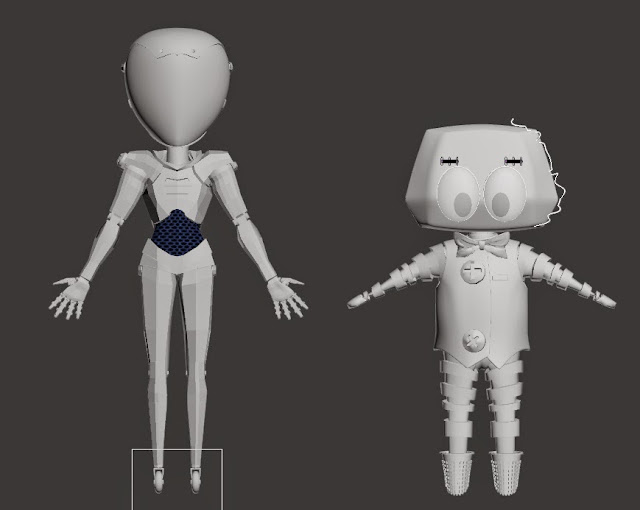
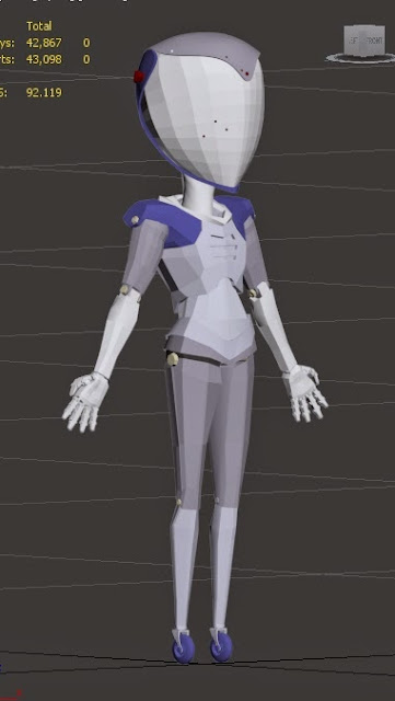.jpg) She had her proportions changed slightly. Her hands encountered some difficulty when being rigged. I designed them badly so they don't work well. Her shoulders as well. :(
She had her proportions changed slightly. Her hands encountered some difficulty when being rigged. I designed them badly so they don't work well. Her shoulders as well. :(
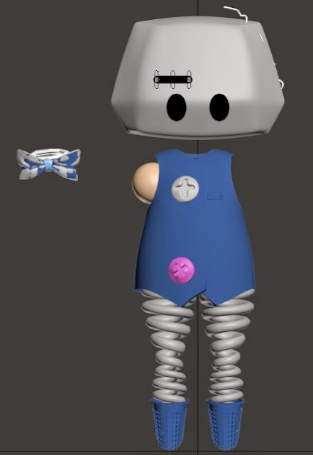.jpg) This is the new Vladimir. A robot, whut? He's supposed to be a robot so he could mesh better with the other character. Problem is, they still look like they're from completely different worlds. I'll have to see what I can do about that.
This is the new Vladimir. A robot, whut? He's supposed to be a robot so he could mesh better with the other character. Problem is, they still look like they're from completely different worlds. I'll have to see what I can do about that.
I'll put things here in the order that they were created (from oldest to newest).
Here are some layout shots that were done near the end of November. I find the layout stage really easy and really ugly.
So, we can see that a base model has been set for the environment, characters, and props. The light shaft lies right above the flower and isn't in the shot.
Here I explored how to create an "organic" looking flower. I'm still unsure about some of this but that's how it is with everything and me, so it'll do for now.
Started with a sphere, sliced, turbosmooth (above all modifiers), tweaked low base mesh of sphere, added FFD modifier above all. I ended up using a free flower head that was quite beautiful (from here) but kept the mid level leaves I created (below head but at top of stem... (confusing)) and the two bottom leaves I created.
Began texturing. *spazzes*
I love texturing. Reaching a realistic look is quite challenging though results can be quite beautiful if done right. I will aspire to do so.
Mmm, checker pattern.
SHADERS!!! <3 And no, I didn't add the stem texture from above. I lied about the order, I actually played with shaders and lighting before doing the texture... And the refined stem/leaves model.
Arnold renderer, you make anything look great. *spazzes again*
.jpg) She had her proportions changed slightly. Her hands encountered some difficulty when being rigged. I designed them badly so they don't work well. Her shoulders as well. :(
She had her proportions changed slightly. Her hands encountered some difficulty when being rigged. I designed them badly so they don't work well. Her shoulders as well. :(.jpg) This is the new Vladimir. A robot, whut? He's supposed to be a robot so he could mesh better with the other character. Problem is, they still look like they're from completely different worlds. I'll have to see what I can do about that.
This is the new Vladimir. A robot, whut? He's supposed to be a robot so he could mesh better with the other character. Problem is, they still look like they're from completely different worlds. I'll have to see what I can do about that.
-_-
SO MANY THINGS TO FIX.
fin.
Labels:
3D,
Final Film Production,
mechanical,
Modeling,
Shaders,
Textures
Subscribe to:
Comments (Atom)


.jpg)

